If you know my work, then you know I love illustration. Sometimes I use it to offset cleaner elements with a touch of imperfection. Other times, I use it to create a world that doesn’t exactly exist in real life. Sometimes I go for a folksy or whimsical style. Other times I go for bold and punchy. There’s usually a wink somewhere in there.
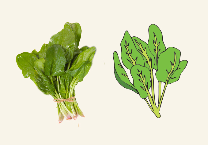
Mostly, I use illustration to represent the essence of something. Photography tends to read as a literal representation of the thing you’re describing, and this can be limiting. You can’t fudge the details of photos, so you spend hours searching for the perfect image or Photoshopping the hell out of an image that’s just OK. Or, you attempt to shoot your own image, but it turns out badly. With photography, there are a million ways to get things wrong.
With illustration, you have control over all of the details. You can invent whatever you need to support the design. Plus, people understand that you’re representing an idea of something rather than the exact thing, so they forgive you if the shapes aren’t quite right, or the colors are exaggerated. This freedom leads to looser, more fun design that engages our imaginations.
I find illustration particularly useful when it comes to creating food brands. Many people jump to the conclusion that luscious food photography is the best way to sell food. Do people really buy food because they’re enticed by static photos of ingredients that have been reproduced on packaging? I would say no. People buy food because they’re enticed by the idea of the beautiful fresh ingredients. This idea is just as easily communicated with words and iconography.
Do you need to see a photo of the food you’re buying—whether it’s in a restaurant or at a store—or would you rather read about the food and create your own version of how it might taste? Imagine if you went to a nice restaurant and the menu had photos next to each item. Aside from being tacky, wouldn’t that take the fun out of ordering?
Photography has its place. If you’re running a food blog or designing a cookbook, then sure, load me up with gorgeous step-by-step imagery and snaps of plated masterpieces. I won’t complain. But photography runs the risk of cheapening food if it’s poorly executed. If the image isn’t lit well, or it’s not properly styled, it’s going to do a disservice to your product. Again, there are a million ways to go wrong. By contrast, illustration allows you to evoke one or two ingredients really well, and then it leaves room for others to fill in the rest.
Of course, drawing is a specific skill that not everyone feels comfortable with. I certainly have my own limitations. Don’t ask me to capture the likeness of a real person because I suck at that. Instead, I’m a fan of simple illustration styles that don’t require precise drawing ability but still have soul. When a job requires something that’s more refined than what I can do myself, I have a few go-to people that I call for help. It’s worth taking the extra step to find a good partner, because their complimentary skills will elevate the quality if your work.
We’re inundated with photography all the time. Taking an illustrated approach can be a way of breaking through the clutter. A package with a beautiful drawing feels like a gift. A package with a beautiful photograph feels like a package. We don’t need to show people what they already know. Instead, we should surprise and delight with unique, artistic representations of the familiar.

