I’ve been told on more than one occasion that a design is too childish.
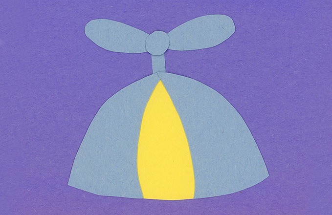
Elements that usually inspire this feedback are bright colors, illustrations, icons, and rounded fonts. Sometimes the concerns are valid, but there are other times when this feedback seems overly simple itself. What makes a design element childish? Lettering that looks hand drawn? Shapes that are loosely rendered instead of crisply generated by a computer? Illustrations instead of photography? If these are the markings of childish design, then what’s wrong with being childish?
There’s a huge difference between work made by an actual child versus professional work that uses organic, loose elements in purposeful ways.
So to me, childlike is a better term than childish to describe some of the work I do. Another important distinction is that childlike cues don’t have to take away from something being sophisticated. Children aren’t the only people who are drawn to bright colors and playful geometry. A loosely-rendered shape that’s cropped in an interesting way can feel boldly elegant, and a clean shape that’s used in a more conventional way can feel sleepy and amateurish. There are no hard and fast rules.
There remains this idea that illustration is for kids and photography is for adults. To me, illustration often feels more sophisticated than photography because it’s more customized for a particular message. As I’ve written about before, it’s easy for photography to feel generic because we see so much of it. This is compounded with the overuse of stock photography. Different brands end up using the exact same images.
To be childlike is to have a sense of curiosity, playfulness and whimsy. Most adults agree that these are good qualities to maintain at any age. A willingness to keep learning and an ability to find delight in small details—this is what makes life interesting. So why not tap into the core of our humanity when talking about mature ideas?
When I’ve worked on technology brands, an illustrated, brightly colored approach is often welcomed. Technology marketers know that products without a human context are impossible to relate to. Whimsy, playfulness and visual surprises bring abstract, sometimes dry ideas to life. Just look at Google. They don’t shy away from a boldly youthful brand identity, and I don’t see anyone questioning their legitimacy.
Ironically, I’ve found that a fear of childishness is especially common when working on children’s brands. It’s as if being associated with children inspires brands to overcompensate on seriousness with a straight-faced design approach. But the simple fact is that brands that take themselves too seriously aren’t usually very memorable.
Whether something appears childlike or not is highly subjective, so I acknowledge that my opinion on this issue isn’t absolute. I also understand that playfulness isn’t right for every brand. In general, I welcome a visual environment that’s filled with bright, fun colors and thoughtful, uniquely crafted imagery. I don’t see any need to tone down whimsy in design. The world is serious enough as it is.