I always present multiple options to my clients. This is especially important for conceptual assignments like logos, book covers and packaging. 90% of the time, I agree with whichever option the client chooses, so it’s a win for both of us. It’s not uncommon to finish a project, look back at the initial concepts presented, and cringe at the rough ideas that (thankfully) never saw the light of day.
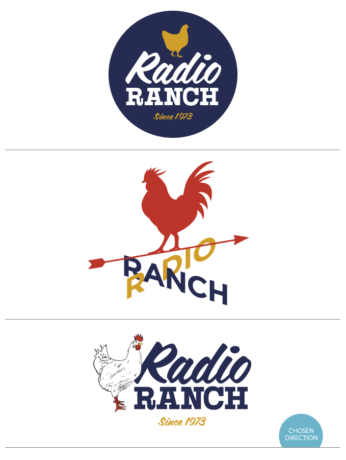
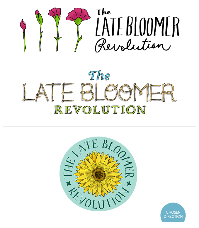
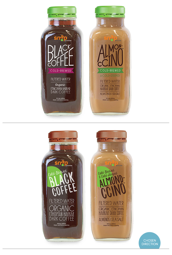
Of course, there are a few cases when the client passes over the concept I like most. Maybe she prefers a safer or simpler design. Or maybe it’s just a difference in personal taste. Whatever the case, here’s a roundup of some of the scrapped concepts from 2013 that I still hold a candle for. I’m showing them alongside the chosen designs. Keep in mind, I’ve spent way more time refining the keepers, so be sure to sprinkle a few grains of salt on the rough ones.
She Writes Press Covers
Letting Go into Perfect Love
Water on the Moon
The Belief in Angels
Radio Ranch Logos
The Late Bloomer Revolution Logos
Icons for Command C
(Responsive web design, custom wordpress websites, design, e-commerce)


